As I continue to make new cards for my Etsy shop "The Reimagined Past", I do quite a bit of research on the images I find. Think it's kind of an extension of my degree in Art History.
I feel a little "geek-ish" when I start reading about something, and end up spending hours perusing websites..so that's why they call it the web!
One area that's become fascinating to me is that of "font-com"/ typography. It feels pretty silly to say, but finding that beautiful/quirky/perfect font can change the essence of the greeting card-which I find fascinating. It's a good thing that the small "stuff" can make me happy!!
The Barnhart Brothers and Spindler company produced some beautiful and striking fonts. For a little history:
http://www.myfonts.com/foundry/Barnhart_Brothers_and_Spindler/
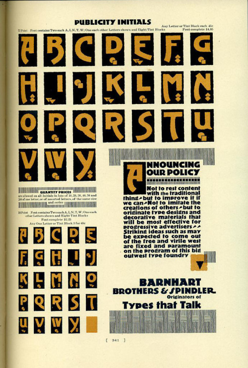
http://dailytypespecimen.com/post/29696266423/publicity-initials-specimen

http://opentype.info/blog/2008/02/18/type-specimen/

http://www.flickr.com/photos/a3-design/4711946448/sizes/z/in/photostream/
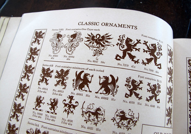
Classic Ornaments
Barnhart Brothers & Spindler; TYPE
Catalog 25; TYPE Faces, border designs, typecast ornaments, brass rule

http://catnipstudiocollage.blogspot.com/2011/11/free-vintage-clip-art-barnhart-bros-and.html
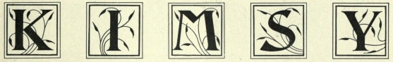
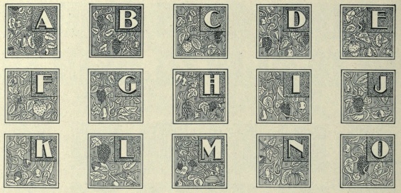
Anglo Initials
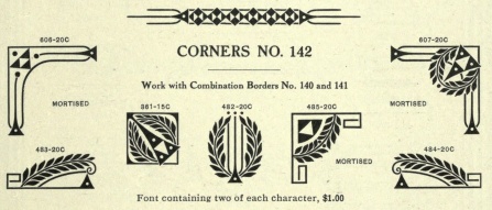
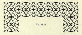
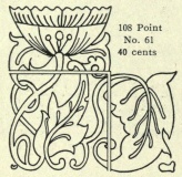
Corners No. 142: ornaments were numbered
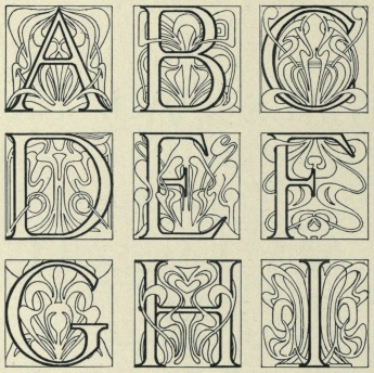
De Vinne Initials
Dearborn Initials
Dolsen Initials No. 8.
Elzevirine Initials
Lining Anglo
No. 82
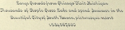
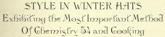
Lining Lakeside Script
Catalog 25; TYPE Faces, border designs, typecast ornaments, brass rule

http://catnipstudiocollage.blogspot.com/2011/11/free-vintage-clip-art-barnhart-bros-and.html
The 1925A catalog
edition was printed between 1925-30 (1930 is latest date on some typeface
examples). The "A" designates the edition with an abbreviated typesetting
equipment section. It was published without a copyright notice which places it
in the public domain. The company, established in 1868, closed in
1933.
I found this website, written by Luc Devroye, from the computer science department of McGill University. WOW WOW WOW
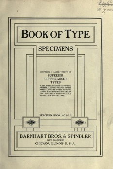
Barnhart Bros. Spindler Type Founders: Book of Type Specimens, 1907
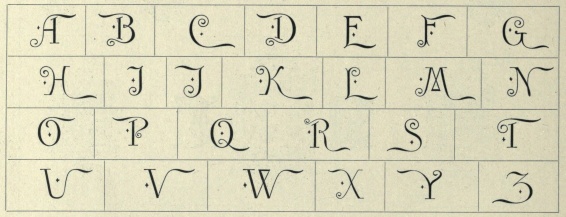
Anglo Initials
| Bard Open. | ||||
 The rightmost border is called Adstyle Border, designed by T.C. Robinson (McGrew gives the date 1908, but that is clearly wrong). McGrew adds: Although these are primarily decorative border units rather than type fonts, they had considerable popularity for expressing names and slogans in the borders of ads and otherwise. Designed by T. C. Robinson in 1908, the letters are a plain gothic style, somewhat thick and thin, similar to nineteenth-century designs. There are seven series: No.1: negative characters in rimmed circle. No.2: positive characters in circle. No.3: negative characters in plain circle. No.4: positive characters in square. No.5: negative characters in square. No.6: positive characters in diamond. No.7: negative characters in diamond. Monotype Special Reversed Figures No. 132S are very similar to Adstyle Border No.5, and in the 12-point size they include X, period, and comma, and single and double figures to 20. | ||||
Corners No. 142: ornaments were numbered
De Vinne Initials
Dearborn Initials
Dolsen Initials No. 8.
Elzevirine Initials
Lining Anglo
No. 82
Lining Lakeside Script
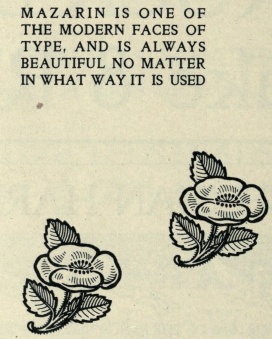
| Mazarin No. 5. | |
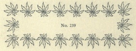
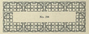
 Mortised Initials  ornament 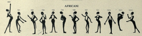 Africani. . 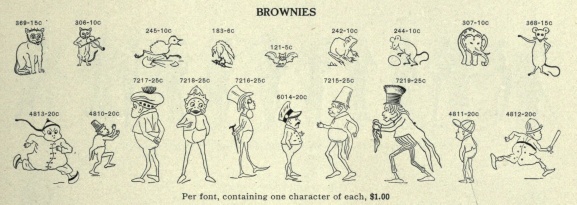 Brownies. I always wondered where these little buggers came from 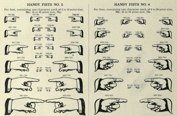 Every foundry had a large supply of fists  series of ornaments called Vogue Ornaments 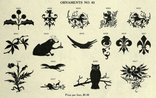 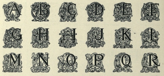 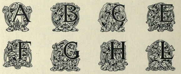 Rococo Initials No. 5 and No. 6 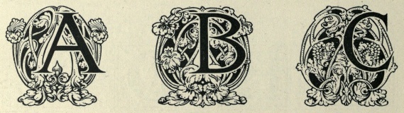 Rococo Initials No. 7. 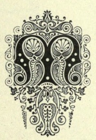 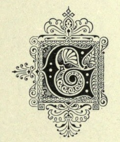 Universal Initials http://luc.devroye.org/BBS-1907/ link to website. Again, WOW WOW WOW | |
No comments:
Post a Comment